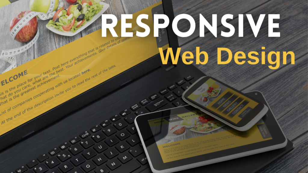
In the rapidly evolving digital landscape, where attention is scarce and competition is fierce, the importance of a responsive website cannot be overstated. A responsive website not only ensures that your visitors have an optimal and user-friendly experience across various devices, but it also reflects your commitment to professionalism and credibility.
Imagine this: a potential customer stumbles upon your website, excited to explore what your business has to offer. However, to their disappointment, the website is not responsive, causing frustration and difficulty in navigating through the content. In just a matter of seconds, that potential customer may decide to abandon your website and seek out a competitor who offers a seamless and responsive browsing experience.
But fear not!
There are ways to overcome this challenge and ensure that your website leaves a lasting impression on your visitors. By investing in responsive design techniques and staying up to date with the latest web development trends, you can create a website that adapts effortlessly to different screen sizes and resolutions. This not only enhances user experience but also increases the chances of converting visitors into loyal customers.
So, take a moment to reflect on the significance of a responsive website in today’s digital age. By prioritizing responsiveness, you are not only ensuring that your first encounter with potential customers is a positive one, but you are also setting the foundation for building long-term relationships that can propel your business to new heights. Trust me, the time and effort invested in optimizing your website’s responsiveness will be well worth it!
Let’s not waste any time – your website holds the key to making a lasting impression. And here’s the thing: that first and crucial encounter could unfortunately also be your final one.
So, stick around as I dive into the reasons behind you need to have a responsive web design and shed light on the ways to overcome it. Trust me, it’s worth the read!
What is Responsive Web Design?
Let’s start with the basics. Picture this: you walk into a store, and as soon as you step in, everything changes to cater to your needs. The shelves rearrange themselves, the store layout transforms, all to make your shopping experience as seamless and efficient as possible. Sounds like something out of a sci-fi movie, right? Well, that’s the power of responsive web design.
Responsive web design is not some high-tech wizardry. It’s about your website adapting in real-time to the device it’s being viewed on. Whether your customer is sitting at their desk browsing on their desktop, relaxing at home with their tablet, or checking out your site on their smartphone during their commute, no matter what devices your customers are juggling, your website delivers an optimized experience.

This isn’t just about aesthetics; it’s about making your digital storefront accessible and user-friendly for everyone. And it’s especially critical in bustling markets like West Palm Beach, where businesses that adopt responsive web design stand out from the crowd. They’re the ones grabbing attention, driving engagement, and boosting their bottom line.
Why Does Responsive Web Design Matter?
In the digital arena, a sleek website is not just a luxury – it’s your lifeline. It’s the heart of your online presence, the digital storefront that keeps your business pulsing. But let’s get real here. A beautiful website that doesn’t perform? That’s like a glossy sports car with no engine.
“Great web design without functionality is like a sports car with no engine.” – Paul Cookson
This isn’t just about having a pretty website. Your site needs to WORK. It needs to adapt. It needs to respond. Enter the game-changer: responsive web design. It’s not just a buzzword; it’s your secret weapon.
Imagine your website morphing seamlessly from desktop to tablet, from smartphone to smart TV. Imagine never losing a customer because your site didn’t load correctly on their device. That’s the power of responsive design. It’s about delivering a smooth, intuitive experience, no matter where your customers are or what device they’re using.
But hold up, we’re not done yet. Let’s take it up a notch with personalization. We’re talking high-quality, data-driven content that speaks directly to your audience. We’re addressing their needs, solving their problems, making their lives better. This isn’t just user experience; this is user delight.
And…Google loves it too. Responsive websites and personalized content don’t just make your users happy; they make search engines happy. You’ll climb those rankings, drive more organic traffic, and watch as your online presence explodes.
So let’s do this. Ditch the generic and embrace the extraordinary. You need a website that doesn’t just look good, but functions flawlessly. Create an online experience that grabs your customers, holds their attention, and refuses to let go. Because in this digital age, good enough isn’t good enough. You need a user-centric design.
Contact Smart Blondes Marketing online today to speak with an expert!